I visited New York’s Museum of Modern Art recently to take in
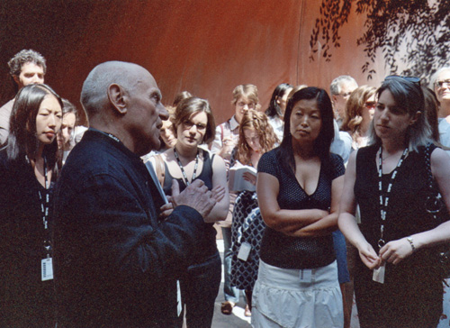
Richard Serra’s 40-year retrospective, and bumped into none other than Mr. Serra himself. He was leading a tour of the exhibit's 26 sculptures for what appeared to be MoMA staffers and I insinuated myself and my camera (see my, uh, exclusive photo of Serra inside "Torqued Ellipse IV" from 1998 above) into the crowd.
Serra’s thinking favors the mathematical and serious and dour. When he talks about his work, he obsesses over its geometry – going on and on about how torqued toruses resemble the rims of bicycle wheels, and how difficult they are to effect in steel, and blah, blah, blah.
I’ve become a big fan of his work from what I’ve seen over the past decade, but not because of his heavy math. For me, his recent stuff is so affecting because of the journeys you make
through it – and at the end of Serra’s tour, he did finally talk about to this. I wasn't taking notes, but he makes a similar point in the exhibit brochure: “I wanted to get away from the imagistic value of an object in an empty space and instead put the focus on the experience of the entirety of the context.”
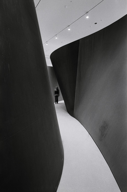
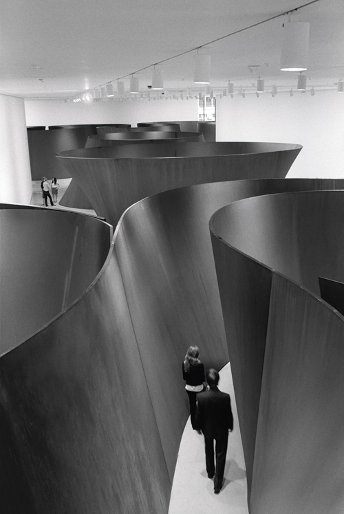
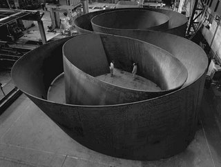
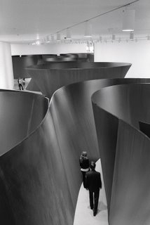
The best sculpture here is “Sequence” from 2006 (pictured above and in the two photos below), a pair of 13-feet-tall rusty brown steel plates aligned in two nested ‘S’s with curly ends that unwind for something like 130 feet. The effect is much like Serra’s walk-in spiral sculptures, but because the structure is bigger the effect is correspondingly more powerful.
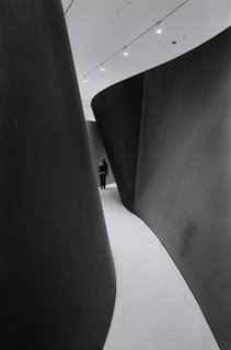
As is apparent in the photo at left, you can’t see over the top of the walls to discern its pattern, so it’s difficult to fathom the design of the space from inside or outside of it. As you walk through the long arm of the ‘S’ from one end to the other, you get the itchy feeling that you’ve been walking too long, that you should have reached the end of the passage by now. You feel a bit lost and claustrophobic. As Serra notes, because the piece is all curves there’s little to use as landmarks to get your bearings. And the way sounds echo through the passages plays disorienting tricks on your ears. Then, finally, it opens into a wide, round chamber that offers a visceral feeling of release and safety.
The sculptures are not as flatteringly displayed as in Serra’s shows at
Gagosian Gallery in Chelsea in recent years.
The key difference is the lighting. When you walk through Serra’s giant spirals and spooning arcs it feels like a distillation of the experience of walking through canyons. (In particular, they remind me of hiking
Starved Rock State Park in Illinois.) The way the massive steel plates – walls really – wiggle in and out subtly shifts how the light falls into the passages between them. Gagosian’s Chelsea space has skylights muted by scrims, creating a soft, fresh, natural light, but MoMA relies on artificial lighting that feels muddy and dull. Still, the sculptures are more flattered inside MoMA than outside. Inside their bulk in relation to their surroundings wows, but outside in MoMA’s sculpture garden, the summer daylight feels harsh and the scale of the surrounding skyscrapers makes Serra’s giant beasts feel dinky.
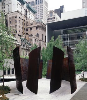
Except for “Sequence,” the work here isn’t as complex as the best of the sculptures Serra has exhibited at Gagosian over the past decade, and correspondingly less interesting. “Intersection II” (pictured at left, outside in MoMA's sculpture garden) is made of four curved plates, or arcs, but at Gagosian, Serra has presented a room-filling set of nested arcs, with gorgeous scratched and rusted surfaces that resembled the colors and textures you find in the tidal zone of an industrial harbor. Here the steel plates are nearly all a uniform golden brown rust.
I guess I’m spoiled by these previous exhibits.

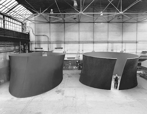
Displayed on the second floor with “Sequence” is a pair of sculptures from last year. “Band” is like a giant strand of ribbon candy. And “Torqued Torus Inversion” (above) is a bracelet-shaped oval of steel standing next to its twin, which is installed upside-down. The result is that one sculpture closes in as it moves toward the ceiling and the other opens up as it moves to the ceiling. But the shapes are too simple, the geometric games blah. And each time you walk right into a deadend chamber, so there’s little journeying. But what remains interesting throughout is Serra’s entrances into the spaces, you kind of squeeze in and out, as if passing through some rusty metal birth canal.

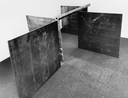
Serra was born in San Francisco in 1939, studied English lit at the University of California in Berkeley and then Santa Barbara, before earning a masters in art at Yale in 1964, where he focused mainly on painting. The sixth floor is filled with the works he constructed in New York in the 1960s and ‘70s and with which he made his name. The best of it is Serra’s exercises in calamity physics – lead plates precariously propped against the wall by a lead tube, or free-standing lead sheets and tubes miraculously balanced against each other, like “1-1-1-1" from 1969 (above). They transcend the dullness of much of the minimalist sculptures of that era, which they resemble, by making the massive, majestic, dangerous force of gravity their subject.
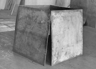
Some critics have griped that protective Plexiglas fences around these works spoil the experience, but as someone who hasn’t seen them in person before (and so in this case ain’t spoiled), the corrals feel goofy while also announcing the pieces’ range of potential violence. In his 1969 sculpture “One Ton Prop (House of Cards)” (left) four steel plates lean tensely against each other to form a box. You gage the distance from it to the safety fence and sense its potential energy, its threat. It’s like estimating the range of a tiger’s leap by scanning the width of the moat around its cage.
Richard Serra “Sculpture: Forty Years,” The Museum of Modern Art, New York, June 3 to Sept. 10, 2007.Pictured from top to bottom: The second two photos are “Sequence,” 2006; installation view of “Sequence,” 2006, and “Torqued Torus Inversion,” 2006, at “Richard Serra Sculpture: Forty Years” in the second-floor contemporary galleries at The Museum of Modern Art; “Intersection II,” 1992-93; and “Torqued Torus Inversion,” 2006. All the preceeding photos are photo by Lorenz Kienzle. “1-1-1-1,” 1969, photo by Jenny Okun; and “One Ton Prop (House of Cards),” 1969, photo by Peter Moore. My portrait of Serra is copyright 2007 me. All the rest are copyright 2007 Richard Serra and sometimes Artists Rights Society (ARS), New York.


 Some photos are straight-up jokes, like Pratt’s 1991 shot of “Washington Crossing the Delaware, Washington Crossing, PA” (at top), in which a Washington impersonator and a gang of guys in spiffy Revolutionary War–era uniforms stroll across a metal truss bridge. The capper is the sign: “Speed limit 15.” So it goes for George Washington’s amphibious 1776 Christmas-night raid that netted 900 Hessian mercenaries at a cost of four Americans injured.
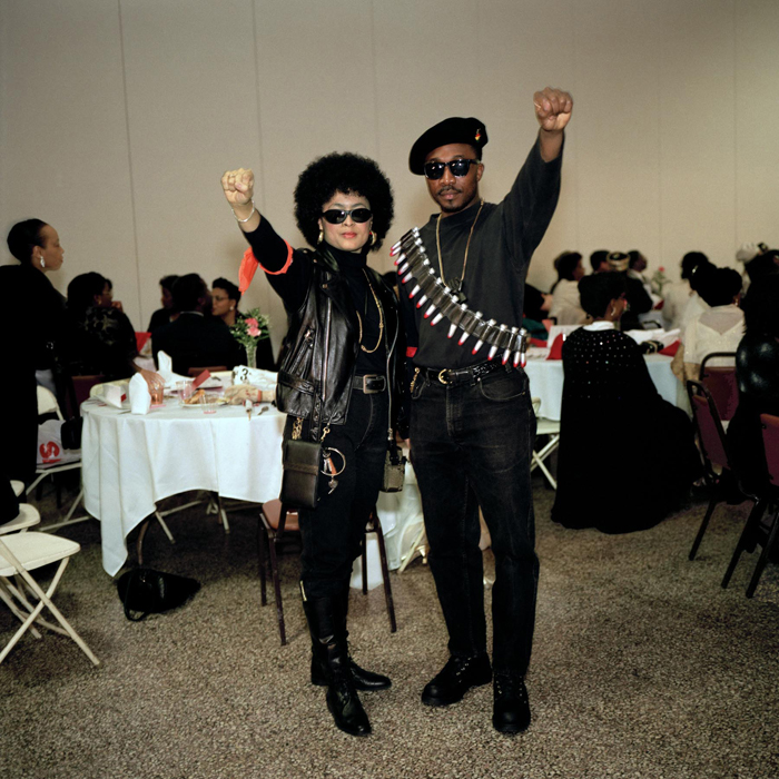 One image in the book shows an African-American waiter in a suit arriving for work at a 1996 “Confederate Ball” in Virginia. He stops in his station wagon to talk to a white guy dressed in the gray military uniform of the Confederacy. In this mundane interaction between real and re-enactment, the sordid slave-holding heart of genteel Confederate society — the unpleasantness one represses if one is organizing a Confederate ball — flashes before your eyes big and mean and ugly. And “Nineteen Lincolns” includes a photo of an African-American couple dressed up as Black Panthers (above), with a toy-bullet bandolier and fists raised in the black-power salute, at a polite 1997 masquerade ball in Baltimore.